Overview
Contracted by Sibling Rivalry Studio to create a design direction for a presentation to their client, Audible. My direction was 1 of 5 options proposed to the client in a very robust and thorough consideration of the Audible brand. On this webpage I’ve presented the highlights of my process, starting with early-on internal logo treatments all the way to final frames presented to client.


Early Explorations
First we started by doing an audit of Audible’s existing branded content. Above imagery was from a Kevin Hart promotional and below was a commercial. Here I simply started to just get a feel for the brand, exploring their color palette and how the logo mark could move.


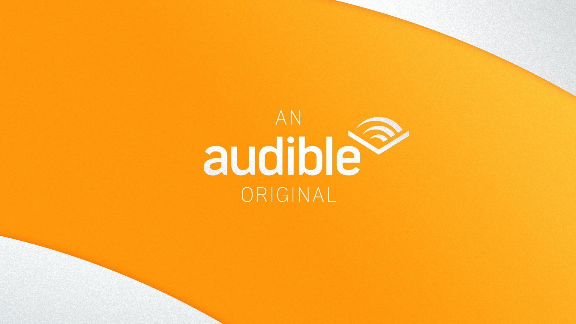
From there I started to look at the logo as a framing device. The graphic color studies (to the left) were discussed durning an internal team review and it was decided then that this look was something worth pursuing.
I continued to evolve this direction as seen in the frames below. Durning that process I decided it would be a worthwhile exercise to reskin an existing promo with this branded look.


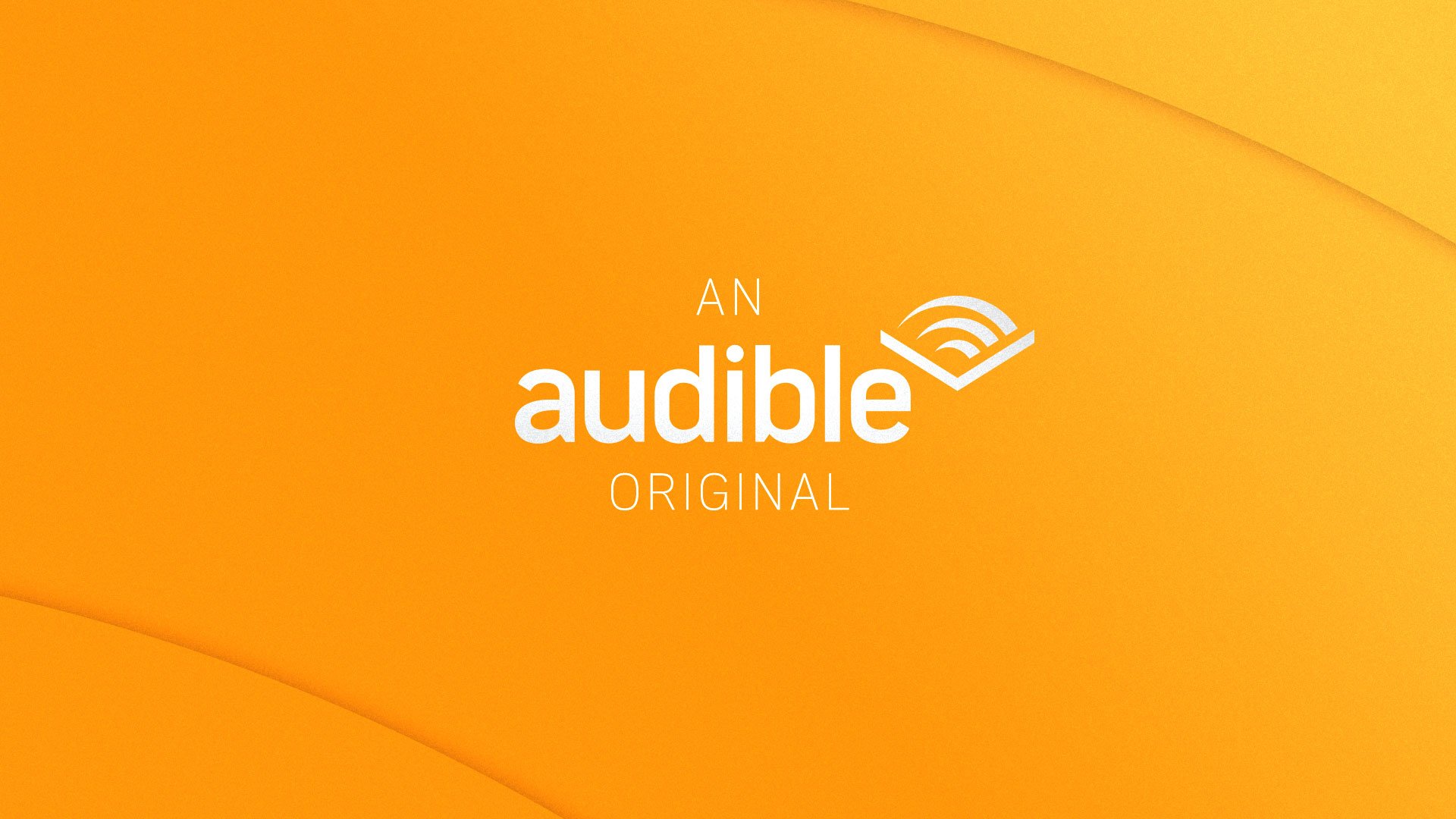
Refinement
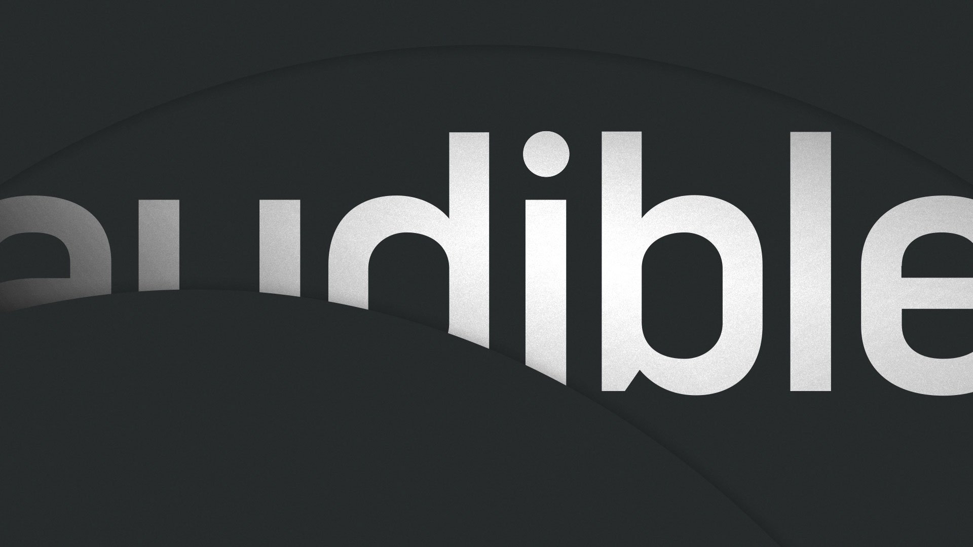
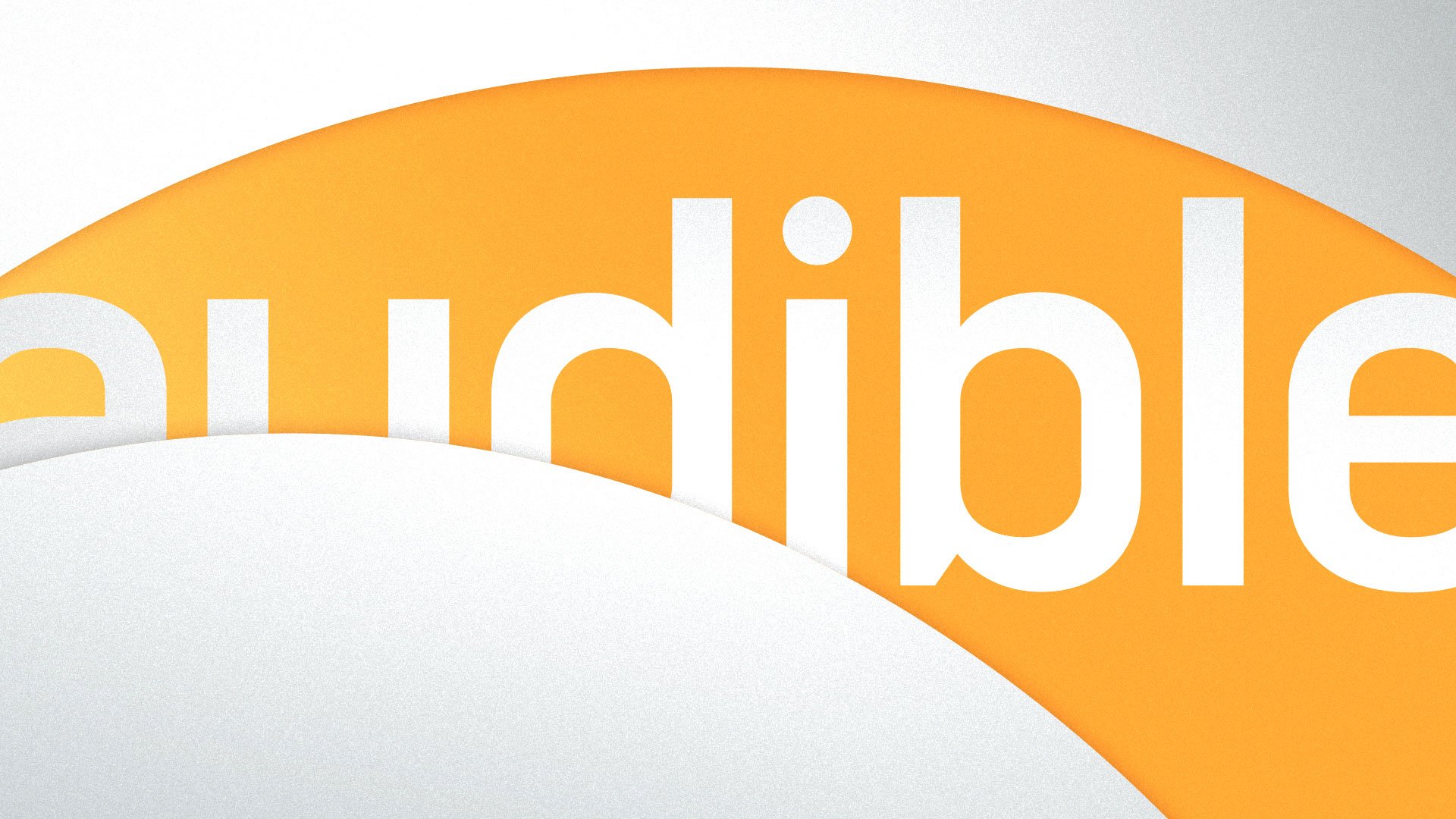
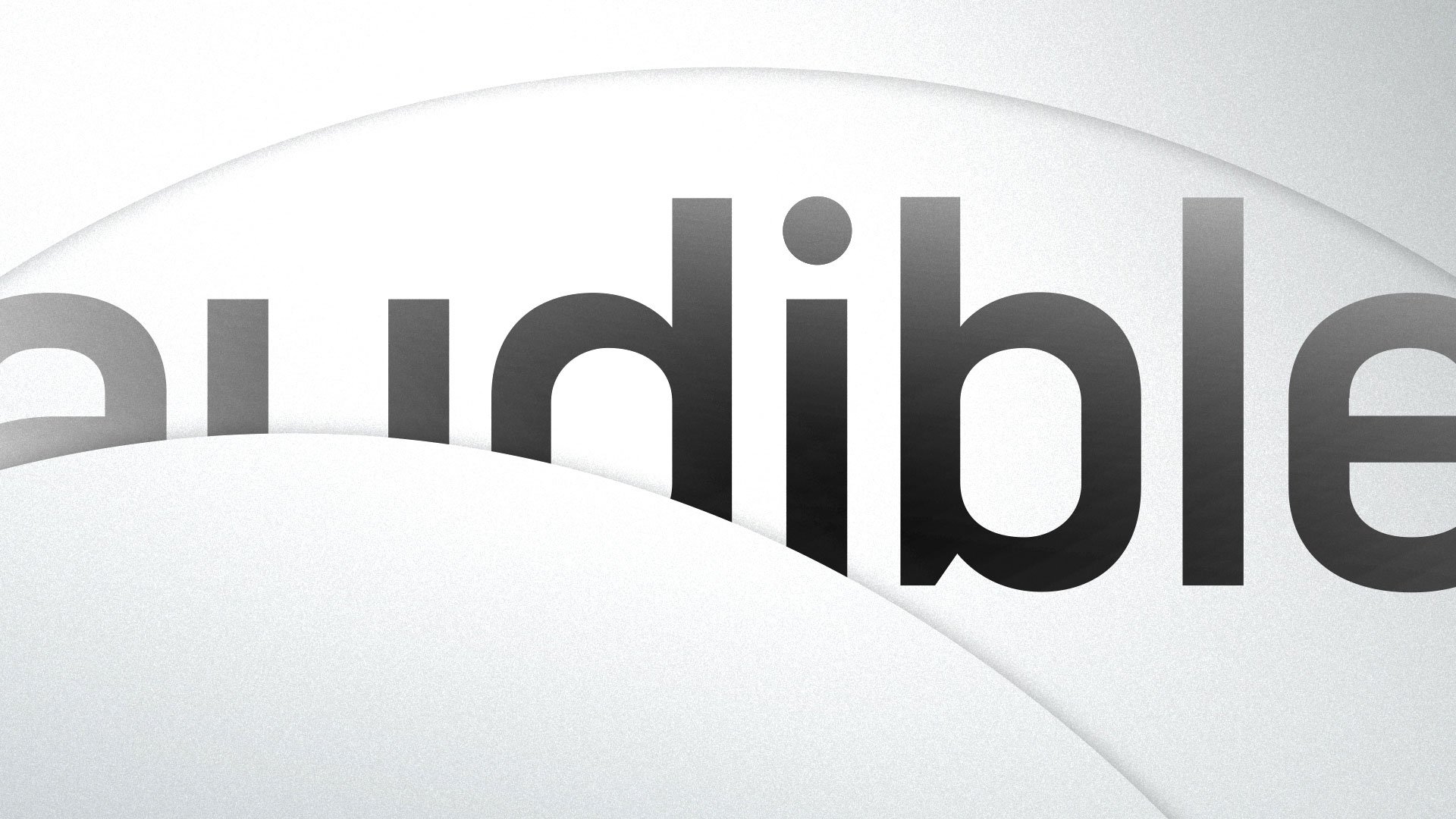
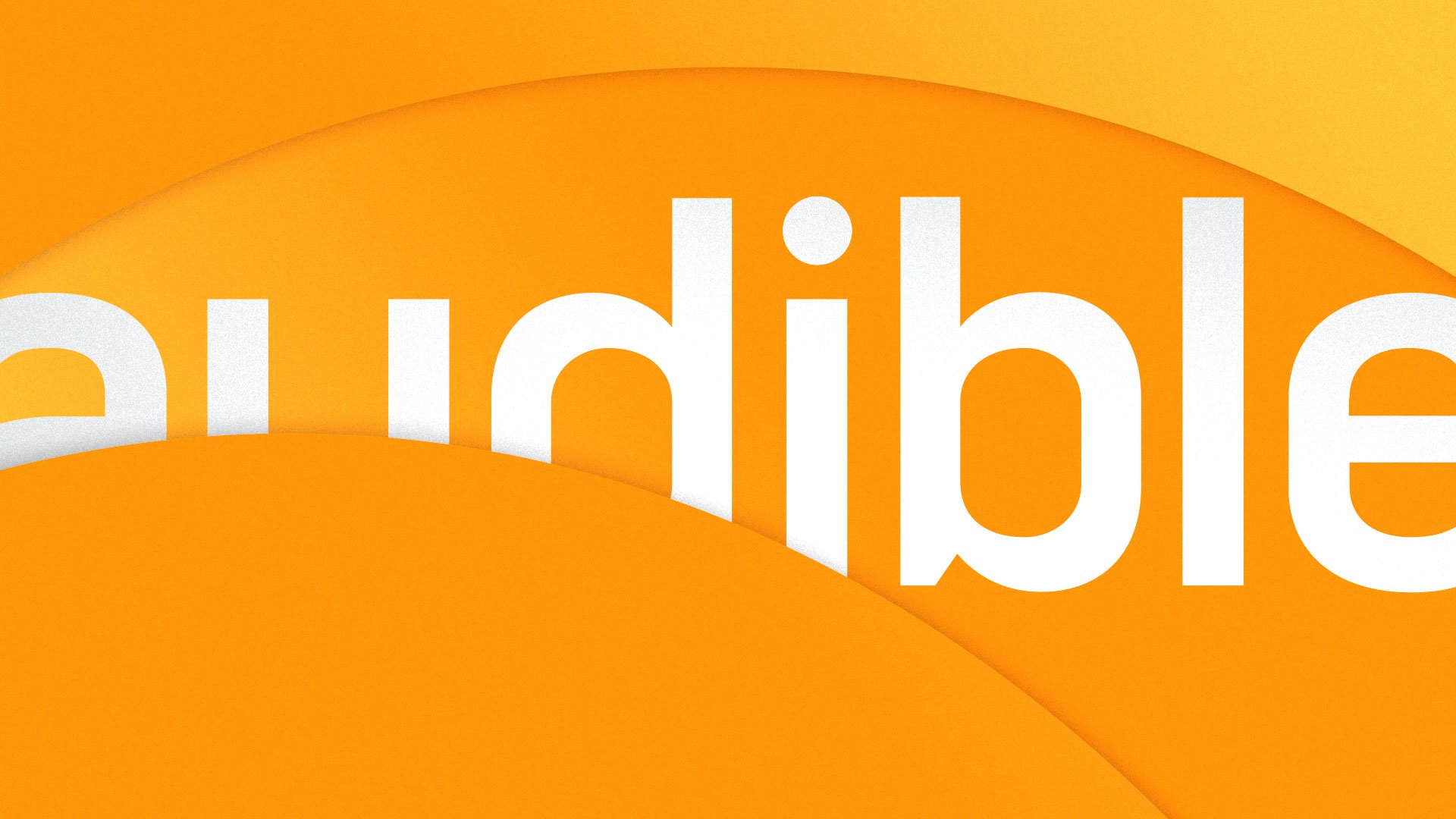
The look continued to evolve as we got closer to finalizing the presentation. As you can see in the above image cycle the bevel highlight went away and I tightened up the shadow to a very close crop. This resulted in a more visually pleasing and less obtrusive aesthetic.
To the right is a study on how color might be used to brand specific categories of Audible’s content.